A photo-led rental website built to translate atmosphere, calm and place into a clear digital experience.
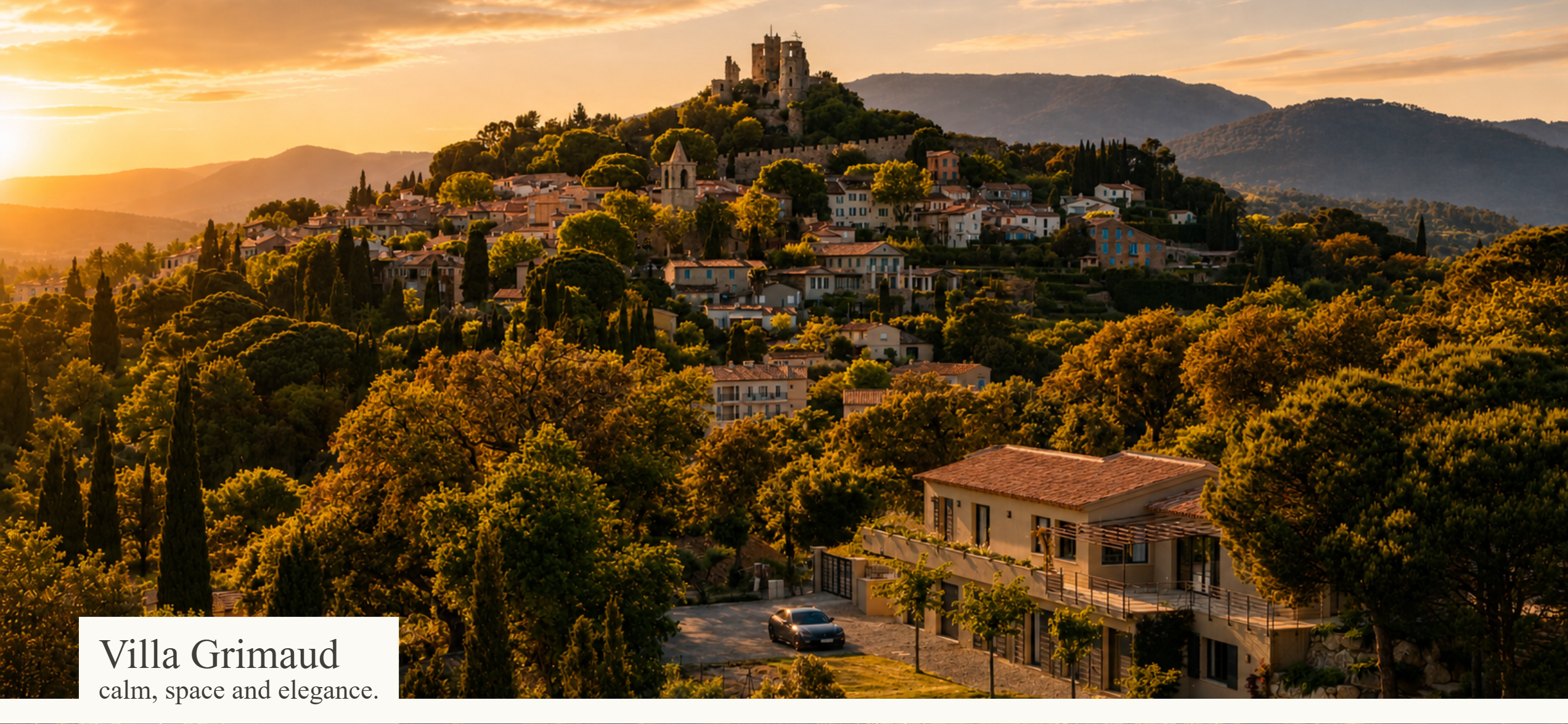
Villa Grimaud came with very little formal brand material. The strongest design direction was already present in the property itself: the light, the views, the stone, the pool, the interior textures and the slow, quiet rhythm of the place. Rather than forcing a heavy visual identity onto it, I used the photography as the design system and built the site around restraint.
The goal was simple: present the villa clearly, make the experience feel calm and elegant, and support reservations without clutter. In this kind of project, the challenge is not to add more design. It is to edit carefully, let the strongest material lead and create a structure that feels as relaxed as the stay being offered.
Structure
I organised the site around the way a guest is likely to browse. First comes atmosphere, then the main villa, the separate studio, the grounds, reservation details and nearby destinations. That structure keeps the experience intuitive and lets visitors move from emotion to practical information without friction.
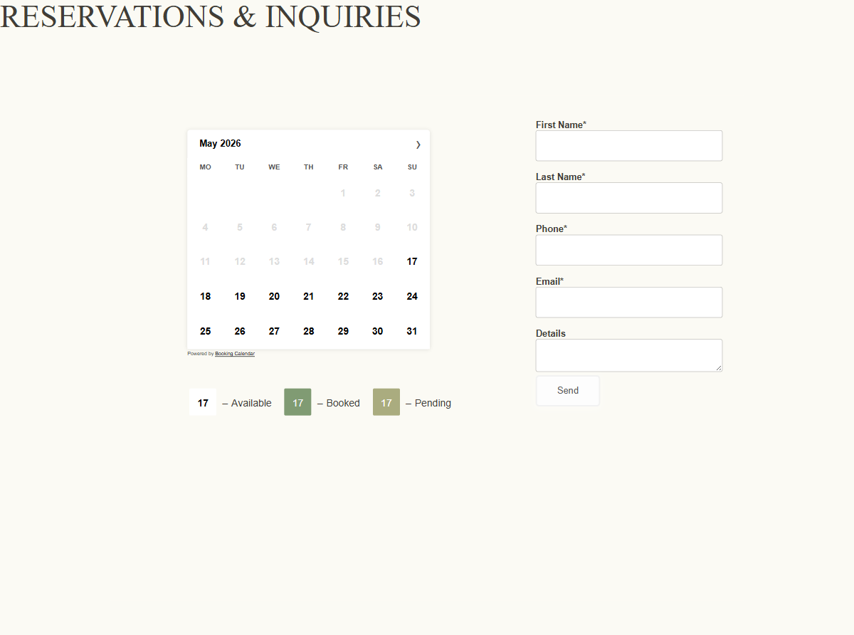
Reservation System
A central part of the build was implementing the reservation system in a way that felt integrated rather than bolted on. The website gives visitors a clear route from interest to enquiry, while keeping the overall experience calm and consistent with the rest of the site. For a rental property, that matters: trust is built not just through visuals, but through how clearly availability and booking intent are handled.
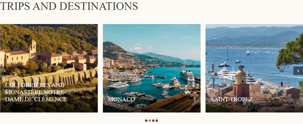
Local Travel Recommendations
I also added a local travel recommendations section to extend the value of the site beyond the property itself. Nearby destinations, day trips and regional highlights help position the villa within a broader Riviera experience. That gives potential guests a better sense of place, improves the usefulness of the website and makes the offer feel more complete.
Visually, the approach stayed light. Spacious layouts, restrained typography and short, descriptive copy were enough because the property images already carried most of the emotional weight. The site does not try to compete with the photography. It gives it room.
The result is a focused brochure-style website that gives the client a clear digital presence, a direct way to present the rental outside third-party platforms and a foundation that can grow over time with seasonal updates and destination content.