Category: portfolio

  • Better News – RSS & News Aggregator App

    Better News – RSS & News Aggregator App

    A self-hosted, intelligent news ecosystem built to reclaim attention and strengthen digital privacy.

    My personal media consumption needed more than a generic aggregator. It needed a coherent ecosystem that filtered noise, meant strictly for local deployment, and transformed information overload into actionable insights.

    I architected a full-stack local environment end to end. This included a resource-efficient AI analysis pipeline, a minimalist mobile-first UI, and a granular quality control system. The result is a unified platform that works seamlessly for daily reading, designed to support mindful consumption while running entirely on local hardware.


    Content Engine

    Hardware-Aware AI Pipeline

    To make running local LLMs viable on standard hardware, I engineered a “Fail-Fast” decision pipeline that minimizes GPU overhead. Instead of processing every article fully, the system strictly enforces a tiered analysis order:

    Language Check: Immediate discard of non-target languages before scraping.

    Scoring Phase (Fast): The AI first reads the raw content to assign a Quality Score and Clickbait Probability. This is a rapid, low-cost operation.

    Filtering Gate: If an article falls below the defined Quality Threshold or exceeds the Clickbait Threshold, processing stops immediately.

    Rewrite Phase (Intensive): Only the high-quality survivors are passed to the expensive rewriting model to generate summaries and fix headlines.

    This approach reduced GPU runtime by approximately 60%, allowing the system to run in the background without impacting daily workstation performance.


    Intelligent Transformation

    Headline Rewrite & Summary

    Beyond simple filtering, the system actively intervenes to reduce cognitive load. I implemented an **AI Headline Rewrite** module that treats the original title as unreliable user input.

    Purpose: To de-sensationalize news and neutralize emotional triggers (e.g., changing “You Won’t Believe What X Did” to “X Announces New Policy”).

    Implementation: The LLM analyzes the full article body to extract the core factual event, then generates a purely descriptive title.


    Quality Control

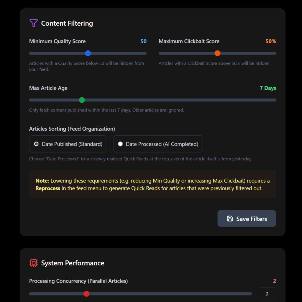
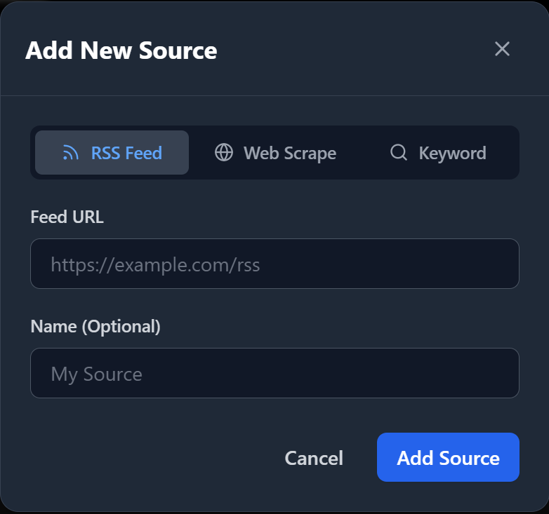
    Granular Filtering Configuration

    The system moves beyond simple keyword blocking, relying instead on semantic understanding to curate the feed. I integrated specific, user-tunable controls to define “quality”:

    Minimum Quality Score (0-100): A distinct threshold that filters content based on depth, neutrality, and factual density.

    Maximum Clickbait Tolerance (0-100%): A probabilistic filter that hides sensationalist or misleading headlines.

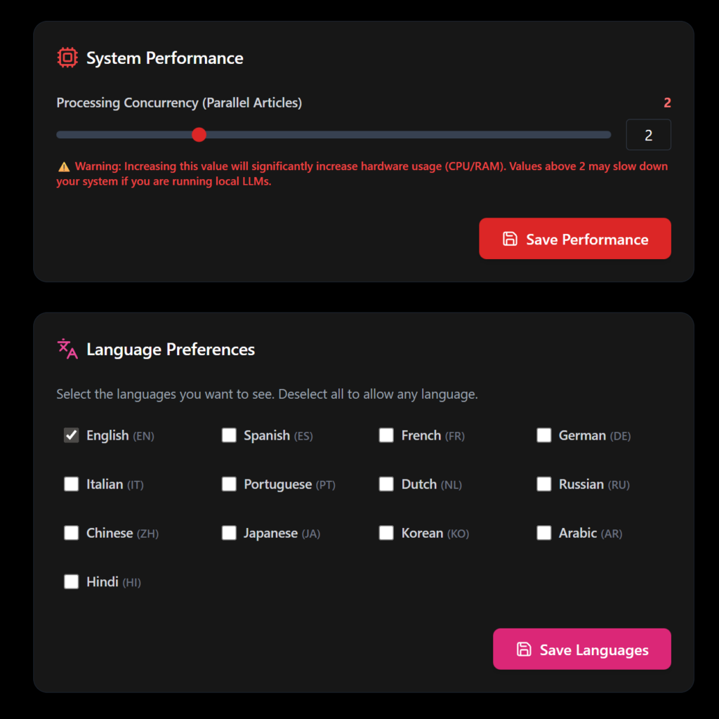
    Processing Concurrency: Adjustable thread control (1-5 concurrent articles) to balance speed against system heat/fan noise.

    Max Article Age: Automated pruning of stale content to ensure relevance.

    Diff-Based Change Detection: Custom logic for static sites that only triggers a new feed item when significant HTML changes occur, ignoring footer/layout updates.


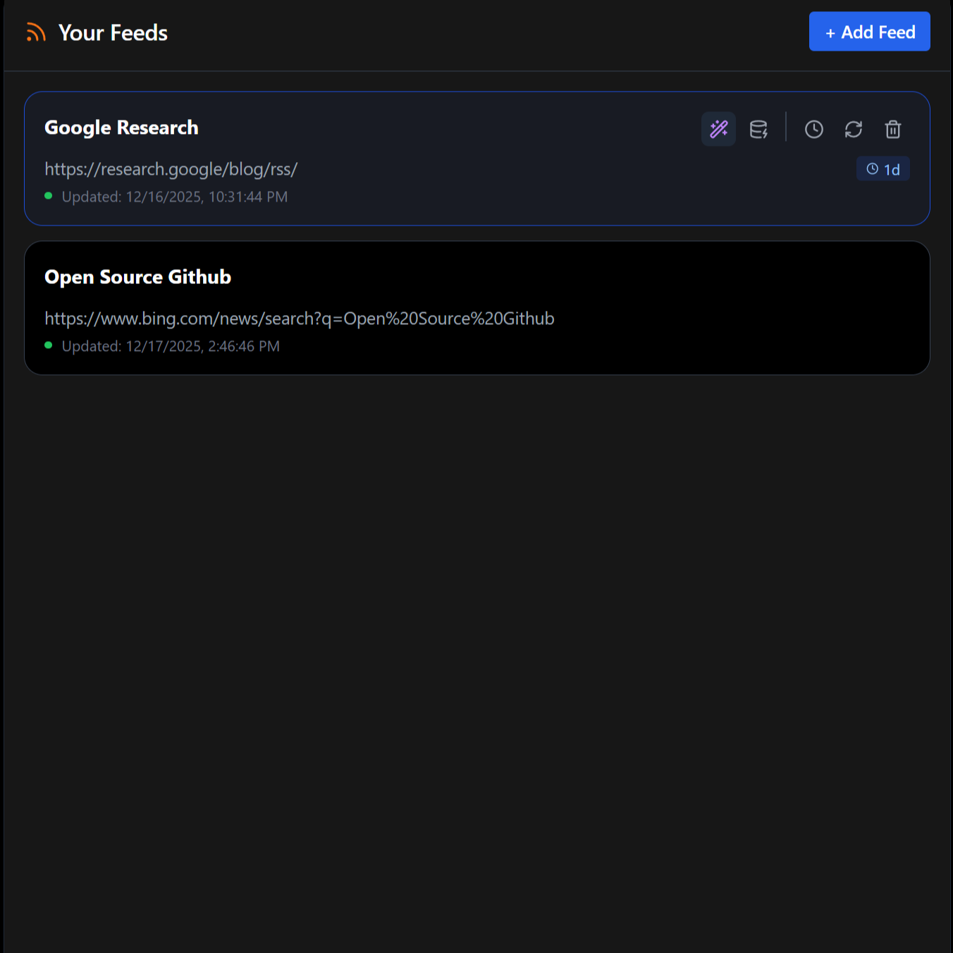
    Resilience & Failsafes

    Recognizing that local AI models can be non-deterministic, I put the user in ultimate control of the data. The system includes manual overrides to recover from model failures:

    Force Reprocessing: A dedicated control to invalidate existing analysis and force the AI to re-read and re-score any feed, correcting potential “bad rolls” or hallucinations.

    Feed Purge: A destructive failsafe to instantly wipe all cached articles and metadata for a specific source. This ensures that if a feed becomes corrupted or the AI repeatedly misinterprets it, the database can be reset to a clean state without affecting the rest of the system.
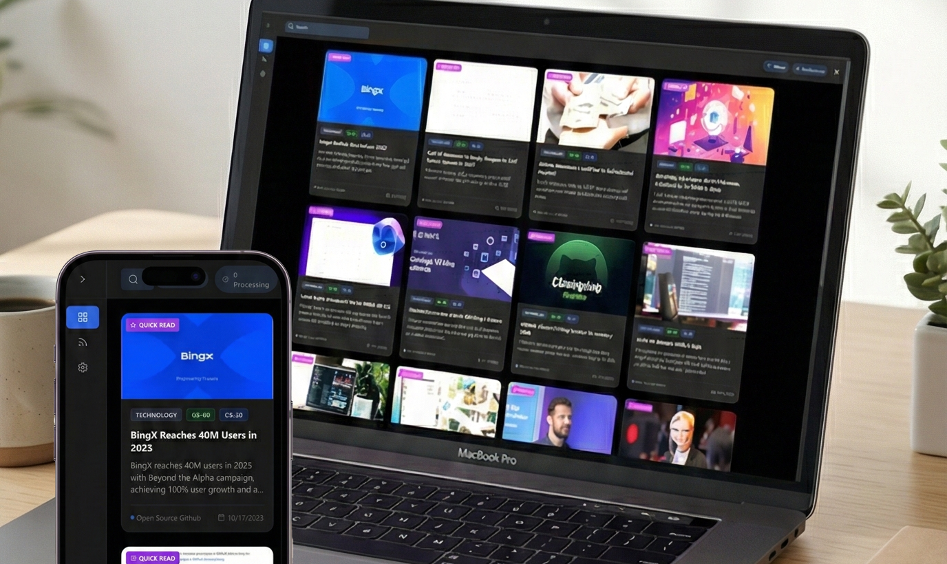

    Digital Platform

    Cleanliness & Mobile-First Design

    The interface was stripped down to the essentials to promote focus. I rebuilt the frontend with a strict adherence to usability standards:

    Mobile-First Architecture: Large touch targets and bottom-weighted navigation for one-handed use.

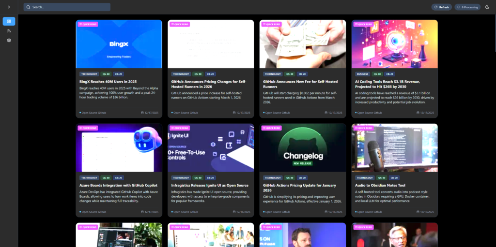
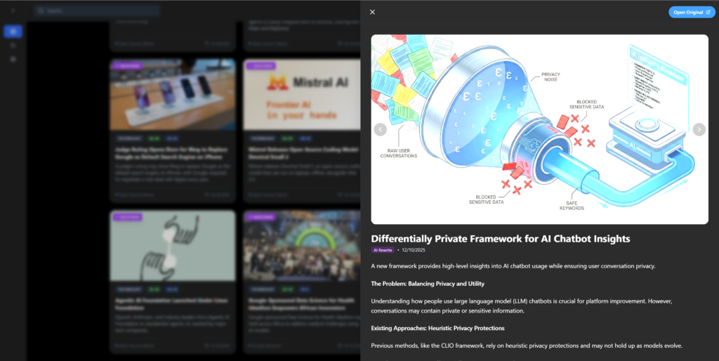
    Quickread Panel: A dedicated slide-over interface that presents the AI-generated high-density summary. This allows users to consume the “Core Facts” of a story instantly without navigating away to the ad-heavy source URL.

    Distraction-Free Reading: A clean, uniform card layout that normalizes content from disparate sources.

    Performance: Sub-second load times and efficient DOM management to ensure the app feels like a native tool rather than a web page.

  • Oko! Magazine

    Oko! Magazine

    I co founded Oko! Magazine and served as its art director, shaping the visual identity, layout system and editorial rhythm of the publication. The spreads below highlight key elements of the magazine’s design language and approach to storytelling.

  • The Czech Pages

    The Czech Pages

    A structured information system designed to make local discovery fast, intuitive, and genuinely useful.

    The Czech Pages is more than a directory. It required designing a clear, scalable data model, building a coherent content system and developing a retrieval layer that interprets user intent rather than simply matching keywords. My role spanned UX design, information architecture, front end development and the creation of a semantic search system that helps users find relevant businesses quickly, even with imperfect or ambiguous queries.

    This project demonstrates how structured data, clean UX and search logic come together to deliver a genuinely useful local discovery tool.

    Foundation

    Data architecture and content mode

    The core challenge was to create a platform that could grow without becoming chaotic.
    I designed a structured data model that defines each listing through consistent taxonomies, metadata and attributes.

    Key work included:

    • Category taxonomy design
    • Standardised metadata fields
    • Multi tag classification
    • Geo and contextual attributes
    • Scalable schema for future categories
    • Clean URL and slug conventions for SEO

    This foundation enables more advanced filtering, semantic search and future features.

    UX Structure

    Designing for clarity, speed and minimal cognitive load

    A directory succeeds only if users can find what they need with no friction. I built a UX framework prioritising clarity, scanability and predictable interaction.

    Key UX decisions included:

    • A mobile first layout
    • A clear split between browse and direct search
    • Card based listings optimised for quick scanning
    • Predictable filter structure
    • Breadcrumb and navigation logic that avoids dead ends
    • Fast access to essential details

    The result is a browsing experience that feels light, trustworthy and efficient.

    Community Features

    A user registration system for a community maintained directory

    Because The Czech Pages is designed as a directory maintained by expats for expats, I built a complete front end registration and contribution system. Users can create an account, add listings and manage their own entries through a streamlined dashboard.

    Key components:

    • Front end user registration
    • Secure login and profile management
    • User dashboard for creating and editing listings
    • Media upload and field validation
    • Moderation workflow for all submissions and edits
    • Notification flow for approval or revision requests

    Listings only go live after moderation, ensuring accuracy and quality across the platform.

    Verified owner badge

    Business owners needed a way to mark a listing as officially managed without creating a pay to win ranking system. I implemented a verification badge that:

    • Confirms ownership
    • Helps users trust the information
    • Has no impact on search position
    • Does not boost visibility
    • Respects the integrity of the ranking algorithm, which remains based on category, search intent and data relevance

    This approach keeps the platform community driven, fair and transparent.

    Semantic Search Layer

    Understanding user intent, not just keywords

    Traditional directory search breaks down when users type ambiguous or incomplete terms. I designed a semantic search layer that interprets meaning and retrieves the most relevant listings.

    Technical work included:

    • Mapping categories into semantic clusters
    • Handling partial, imperfect and multilingual queries
    • Defining fallback behaviours
    • Optimising search performance within WordPress constraints

    This dramatically improves the quality of results and reduces user frustration.

    Visual and Front End Design

    A clean, neutral interface that supports the content

    The design is intentionally minimal so the content can take priority. The visual system is built around clean typography, generous spacing and an intuitive card based structure.

    Work included:

    • A neutral colour palette
    • Typography for clarity and hierarchy
    • Card layouts and iconography
    • Smooth transitions and interaction cues

    The interface feels modern, trustworthy and easy to navigate.

  • The Storytellers PR

    The Storytellers PR

    A cohesive brand and communication system built to support clarity, consistency, and professional storytelling.

    The Storytellers PR needed a complete refresh of their brand and website with a short turnaround. Their existing presence no longer reflected the quality of their work, and they needed a platform that could communicate clearly, publish quickly and support the agency’s growing portfolio.

    I redesigned their identity, built an editorially driven website and developed a custom WordPress backend with a lightweight theme tailored to their content structure. The result is a cohesive system that looks modern, reads with clarity and allows the team to publish new work with very low friction.

    Foundation

    Brand identity and visual direction

    The first priority was to define a clear identity that matched the agency’s strategic and narrative approach. The visual direction is clean, editorial and typography driven, designed to feel premium without being overly ornamental.

    Delivered elements included:

    • Logo refinement and responsive variants
    • A typographic system built around editorial hierarchy
    • A neutral yet confident color palette
    • Social and presentation templates
    • Image and layout rules for consistent storytelling

    This provided a stable visual foundation before developing the website.

    Digital Platform

    Rapid website rebuild with a custom WordPress theme

    The client needed a website that could be delivered quickly but still feel highly polished and structured. I built a new site on WordPress with a custom lightweight theme designed specifically for their content model.

    Key improvements included:

    • Streamlined information architecture focused on narrative clarity
    • Modular layout blocks for case studies and newsroom articles
    • A homepage designed as a clean editorial introduction
    • A simplified WordPress backend so the team can publish without complexity
    • Performance and SEO improvements built directly into the theme
    • A content structure that is flexible enough for future expansion

    The site now works as a practical, modern publishing tool rather than a static showcase.

    Editorial and Messaging

    A structured voice that fits the agency’s storytelling focus

    I refined the core site messaging to ensure consistency with the updated brand identity and the agency’s editorial style.

    Deliverables included:

    • About page tone refinement
    • Service descriptions rewritten for clarity and trust
    • Case study structure and headline hierarchy
    • Newsroom article formatting guidelines

    The results are clean, credible and easy for the agency to maintain.

  • Barber Studio Don

    Barber Studio Don

    A complete digital and visual ecosystem built to fill chairs and strengthen customer trust.

    Barber Studio Don needed more than a website. They needed a coherent ecosystem that connected every touchpoint of their business: online presence, studio materials, booking flow, customer communication and ongoing brand visibility.

    I rebuilt their full digital environment end to end. This included brand identity refresh, responsive website development, integrated booking logic, analytics dashboards, and all print materials such as service menus, posters and promotional cards. The result is a unified brand that works seamlessly for both customers and staff, and a system designed to support daily operations while driving measurable growth.

    Foundation

    Brand identity, visual language and studio materials

    The first step was to bring clarity and consistency to the visual identity. The studio received a cohesive design system applied across:

    • Service menus
    • Price cards
    • Window signage
    • Posters and seasonal promotional materials
    • Loyalty cards
    • Social media templates

    This ensured that customers experience the same brand tone whether they walk past the window, browse online or book an appointment.

    Digital Platform

    Website, booking flow and technical foundation

    Barber Studio Don needed a website focused on clarity and speed.
    I designed and rebuilt the entire platform with a focus on performance, usability and conversion. Core improvements included:

    • A clear and focused content architecture
    • A mobile first interface built to bring users directly to booking
    • A custom booking flow fully integrated with Noona
    • SEO focused metadata, structure and schema
    • Performance tuning for faster load times and improved ranking

    The new site serves as the central hub of the business, linking studio operations, Google Business visibility, social channels and analytics.

    Social Visibility

    Content planning and communication strategy

    To support ongoing customer acquisition and brand memory, I developed a repeatable communication system:

    • Reel and post templates
    • Seasonal content planning
    • Clear messaging guidelines
    • Photo treatment and visual consistency
    • Studio announcements, promotions and Google Business updates

    This allowed the client to continue publishing in a clear, on brand format without needing constant outside support.